Ever wanted to create a chat widget for your stream, but don't know where to start? I'll help you to create your own custom chat widget in StreamElements with this step by step tutorial.

Jump to section:
- Introduction
- Adding the Base Code
- Customizing Your Widget in StreamElements
- Backing Up Your Widget
- Sharing and Selling Your Widget
- Conclusion
Introduction
Creating your own Twitch chat widget is a fun way to add personality and style to your stream.
While StreamElements offers many widgets, I noticed a lack of beginner-friendly tutorials for building a fully custom chat widget. This guide walks you step-by-step through the process, so you can create, customize, and safely back up your widget.
Let’s get started!
Adding the Base Code
-
Open your StreamElements Overlays Dashboard.
-
Click on New overlay and give it a name (e.g.
Custom Chat). -
Expand Settings and click Open editor.
-
Navigate to the StreamElements’ CustomChat GitHub repo.
HTML
Copy the code from widget.html:
<script src="//cdnjs.cloudflare.com/ajax/libs/blueimp-md5/2.12.0/js/md5.min.js"></script>
<div class="main-container"></div>
CSS
Copy the code from widget.css:
@import url('https://cdnjs.cloudflare.com/ajax/libs/animate.css/3.5.2/animate.min.css');
@import url('https://fonts.googleapis.com/css?family=');

* {
    font-family: '', sans-serif;
    color: ;
    overflow: hidden;
    font-weight: ;
    text-shadow:{textShadow};
}

.main-container{
    display:;
    flex-direction: column;
    justify-content: flex-end;
    align-items: flex-start;
    align-content: flex-start;
    height:98%;
    margin-bottom:10px;
    box-sizing: border-box;
}

.message-row{
    flex: 0 0 auto;
    width:100%;
    margin-bottom:5px;
    background-color:;
    padding:5px;
    vertical-align: baseline;
}

.badge{
    display:;
    height:px;
}

.user-box{
    display:inline;
    font-size:px;
}

.user-box > span{
    font-size:px;
}

.user-message{
    display:inline;
    font-size:px;
    word-wrap: break-word;
}

.emote{
    height: {emoteSize}px;
    vertical-align: middle;
    background-repeat:no-repeat;
}

.action{
    font-style: italic;
}
You’ll add more custom styling later.
JS
Copy the code from widget.js. This handles incoming messages, badges, emotes, animations, and other logic.
Fields
Copy the code from widget.json. This defines the settings you’ll see in the StreamElements editor (fonts, colors, animations, and more).
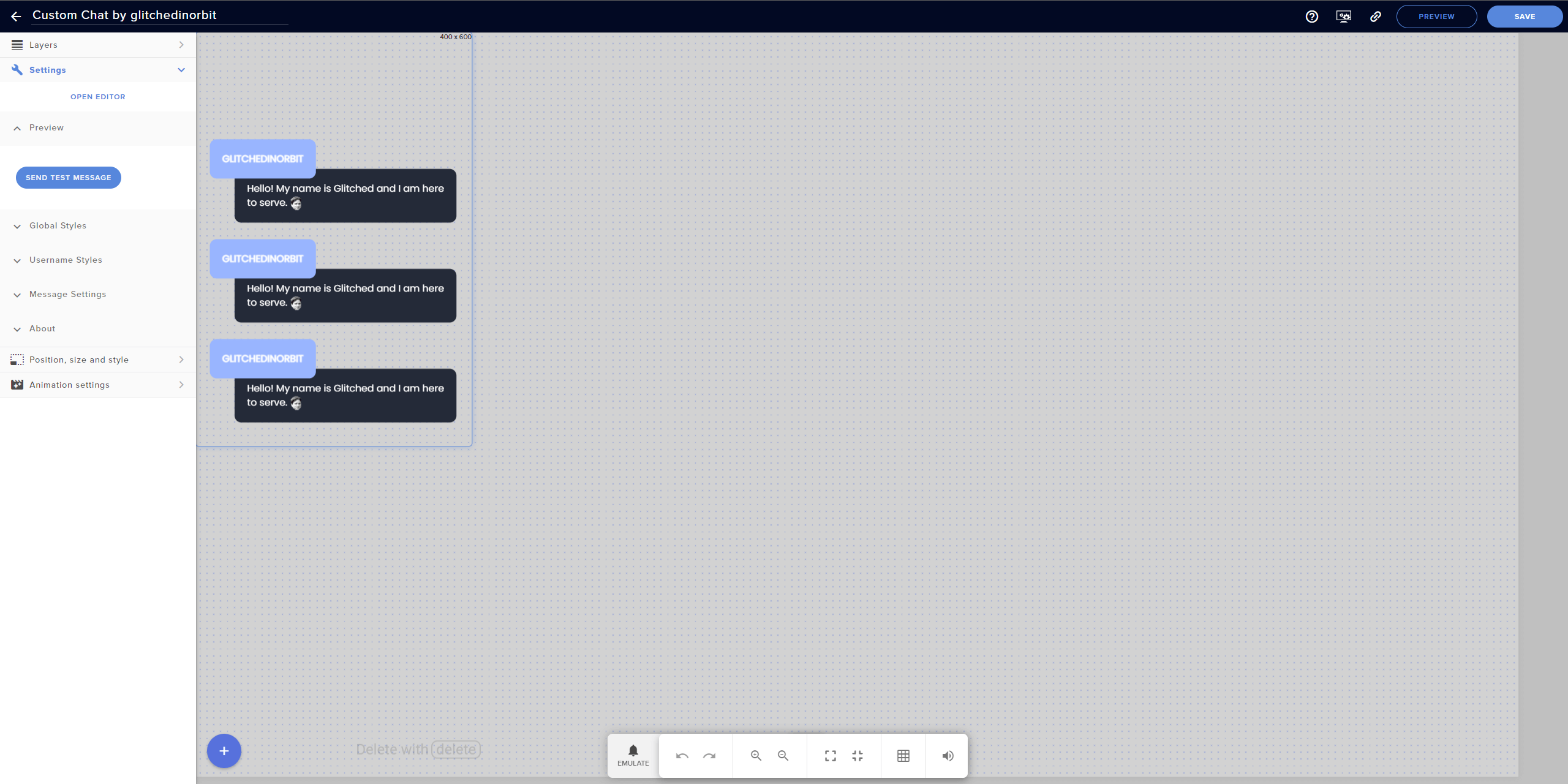
Customizing Your Widget in StreamElements
Now that the base is set, you can make your widget unique.
Here’s a quick example of a minimal, clean style:
Custom CSS
We’ll tackle the CSS portion of the chat widget, so let’s add properties in between @import and * { that allow full control over the way our widget looks.
/* Reset default browser styles */
html,
body {
  margin: 0;
  padding: 0;
}

/* Set base font size and prevent scrolling */
html {
  overflow: hidden;
  font-size: var(--baseFontSize);
}
From the .main-container section, delete everything except for the following:
/* Main container for all chat messages */
.main-container{
  display:;
  flex-direction: column;
  justify-content: flex-end;
  height:98%;
}
The user-box section applies to everything regarding the box where the username is. From this section, change and delete some properties:
/* Username box styling */
.user-box{
  position: absolute;
  background-color: ;
  font-size:px;
  font-weight: 800;
  z-index: 99;
  top: 2%;
  padding: 18px;
  margin-top: auto;
  left: %;
  text-align: left;
  width: block;
  margin-left: 20px;
  margin-right: 20px;
  border-radius: 10px;
  text-transform: uppercase;
}

.user-box > span{
  font-size:px;
  text-align: left;
  margin-right: 20px;
}
Both the .message-row and .user-message apply to the box and actual message underneath the username. From this section, change and delete some properties as well:
/* Message box styling */
.message-row{
  position: relative;
  flex: 0 0 auto;
  margin-bottom:20px;
  vertical-align: baseline;
  padding-top: 40px;
  padding-right: 18px;
  text-align: left;
  margin-right: 20px;
}

.user-message{
  display:inline-block;
  font-size:px;
  background-color: ;
  height: auto;
  top: 5.5%;
  max-width:95%;
  position: relative;
  word-wrap: break-word;
  padding: 18px;
  left: %;
  margin-left: 20px;
  margin-right: 20px;
  border-radius: 10px;
}
Lastly, set the properties for .badge, .emote, and .action:
/* Badges, emotes, and /me actions */
.badge{
  display: ;
  height: 1em;
  position: relative;
  line-height: 1em;
  vertical-align: middle;
  top: -0.1em;
}

.emote{
  height: {emoteSize}px;
  vertical-align: middle;
  background-repeat:no-repeat;
}

.action{
  font-style: italic;
}
Custom Fields
Organize your widget settings in the StreamElements Editor by updating the Fields:
- Rename Test Message to Preview.
- Group global styles (font, color, size) into a
Global Stylessection. - Add
Username Styles(nickname color, background, badges, position). - Add
Message Settings(message limit, hide after seconds, ignored users). - Add
About(widget name, author, version).
  "testMessage": {
    "type": "button",
    "label": "Send test message",
    "value": "Test message",
    "group": "Preview"
  },
  "fontName": {
    "type": "text",
    "label": "Font name",
    "value": "Montserrat",
    "group": "Global Styles"
  },
  "fontSize": {
    "type": "number",
    "label": "Font size",
    "value": 24,
    "group": "Global Styles"
  },
  "fontWeight": {
    "label": "Font weight",
    "type": "dropdown",
    "value": "400",
    "options": {
      "100": "Thin (100)",
      "300": "Light (300)",
      "400": "Regular (400)",
      "500": "Medium (500)",
      "700": "Bold (700)",
      "900": "Black (900)"
    },
    "group": "Global Styles"
  },
  "fontColor": {
    "type": "colorpicker",
    "label": "Font color",
    "value": "rgba(255,255,255,1)",
    "group": "Global Styles"
  },
  "messagebackgroundColor": {
    "type": "colorpicker",
    "label": "Background color",
    "value": "rgba(0,0,0,0)",
    "group": "Global Styles"
  },
  "alignMessages": {
    "label": "Align messages",
    "type": "dropdown",
    "value": "flex",
    "options": {
      "flex": "Bottom",
      "block": "Top"
    },
    "group": "Global Styles"
  },
  "animationIn": {
    "type": "dropdown",
    "label": "Animation in",
    "value": "none",
    "options": {
      "none": "None",
      "bounceIn": "bounceIn",
      "bounceInDown": "bounceInDown",
      "bounceInLeft": "bounceInLeft",
      "bounceInRight": "bounceInRight",
      "bounceInUp": "bounceInUp",
      "fadeIn": "fadeIn",
      "fadeInDown": "fadeInDown",
      "fadeInDownBig": "fadeInDownBig",
      "fadeInLeft": "fadeInLeft",
      "fadeInLeftBig": "fadeInLeftBig",
      "fadeInRight": "fadeInRight",
      "fadeInRightBig": "fadeInRightBig",
      "fadeInUp": "fadeInUp",
      "fadeInUpBig": "fadeInUpBig",
      "flipInX": "flipInX",
      "flipInY": "flipInY",
      "lightSpeedIn": "lightSpeedIn",
      "rotateIn": "rotateIn",
      "rotateInDownLeft": "rotateInDownLeft",
      "rotateInDownRight": "rotateInDownRight",
      "rotateInUpLeft": "rotateInUpLeft",
      "rotateInUpRight": "rotateInUpRight",
      "slideInUp": "slideInUp",
      "slideInDown": "slideInDown",
      "slideInLeft": "slideInLeft",
      "slideInRight": "slideInRight",
      "zoomIn": "zoomIn",
      "zoomInDown": "zoomInDown",
      "zoomInLeft": "zoomInLeft",
      "zoomInRight": "zoomInRight",
      "zoomInUp": "zoomInUp",
      "jackInTheBox": "jackInTheBox",
      "rollIn": "rollIn"
    },
    "group": "Global Styles"
  },
  "animationOut": {
    "type": "dropdown",
    "label": "Animation out",
    "value": "none",
    "options": {
      "none": "None",
      "bounceOut": "bounceOut",
      "bounceOutDown": "bounceOutDown",
      "bounceOutLeft": "bounceOutLeft",
      "bounceOutRight": "bounceOutRight",
      "bounceOutUp": "bounceOutUp",
      "fadeOut": "fadeOut",
      "fadeOutDown": "fadeOutDown",
      "fadeOutDownBig": "fadeOutDownBig",
      "fadeOutLeft": "fadeOutLeft",
      "fadeOutLeftBig": "fadeOutLeftBig",
      "fadeOutRight": "fadeOutRight",
      "fadeOutRightBig": "fadeOutRightBig",
      "fadeOutUp": "fadeOutUp",
      "fadeOutUpBig": "fadeOutUpBig",
      "flipOutX": "flipOutX",
      "flipOutY": "flipOutY",
      "lightSpeedOut": "lightSpeedOut",
      "rotateOut": "rotateOut",
      "rotateOutDownLeft": "rotateOutDownLeft",
      "rotateOutDownRight": "rotateOutDownRight",
      "rotateOutUpLeft": "rotateOutUpLeft",
      "rotateOutUpRight": "rotateOutUpRight",
      "slideOutUp": "slideOutUp",
      "slideOutDown": "slideOutDown",
      "slideOutLeft": "slideOutLeft",
      "slideOutRight": "slideOutRight",
      "zoomOut": "zoomOut",
      "zoomOutDown": "zoomOutDown",
      "zoomOutLeft": "zoomOutLeft",
      "zoomOutRight": "zoomOutRight",
      "zoomOutUp": "zoomOutUp",
      "rollOut": "rollOut"
    },
    "group": "Global Styles"
  },
  "emoteSize": {
    "type": "number",
    "label": "Emote size",
    "value": 24,
    "group": "Global Styles"
  },
  "sliderMessage": {
    "label": "Horizontal message position",
    "type": "slider",
    "value": "1",
    "max": 10,
    "min": 0,
    "step": 1,
    "value": 0,
    "group": "Global Styles"
  },
  "nickColor": {
    "type": "dropdown",
    "label": "Username color",
    "value": "user",
    "options": {
      "user": "As on twitch",
      "messagecolor": "Same as message text",
      "custom": "Specified below",
      "remove": "Remove username"
    },
    "group": "Username Styles"
  },
  "customNickColor": {
    "type": "colorpicker",
    "label": "Custom username color",
    "value": "rgba(0,255,0,1)",
    "group": "Username Styles"
  },
  "userbackgroundColor": {
    "type": "colorpicker",
    "label": "Username background color",
    "value": "rgba(0,0,0,1)",
    "group": "Username Styles"
  },
  "displayBadges": {
    "type": "dropdown",
    "label": "Display badges",
    "value": "inline",
    "options": {
      "inline": "Yes",
      "none": "No"
    },
    "group": "Username Styles"
  },
  "sliderNickname": {
    "label": "Horizontal username position",
    "type": "slider",
    "value": "1",
    "max": 25,
    "min": 0,
    "step": 1,
    "value": 0,
    "group": "Username Styles"
  },
  "messagesLimit": {
    "type": "number",
    "label": "Message limit",
    "value": 4,
    "group": "Message Settings"
  },
  "hideAfter": {
    "type": "number",
    "label": "Hide after seconds (999 to disable)",
    "value": 999,
    "group": "Message Settings"
  },
  "hideCommands": {
    "label": "Hide lines starting with ! (!command)",
    "type": "dropdown",
    "value": "yes",
    "options": {
      "yes": "Yes",
      "no": "No"
    },
    "group": "Message Settings"
  },
  "ignoredUsers": {
    "label": "Ignored users (comma separated)",
    "type": "text",
    "value": "StreamElements,OtherBot",
    "group": "Message Settings"
  },
  "widgetName": {
    "label": "Custom Chat",
    "type": "hidden",
    "value": "Custom Chat",
    "group": "About"
  },
  "widgetAuthor": {
    "label": "Tutorial by glitchedinorbit",
    "type": "hidden",
    "value": "glitchedinorbit",
    "group": "About"
  },
  "widgetVersion": {
    "type": "hidden",
    "value": "1.0",
    "group": "About"
  },
  "widgetUpdateUrl": {
    "type": "hidden",
    "value": "https://",
    "group": "About"
  }
Custom Data
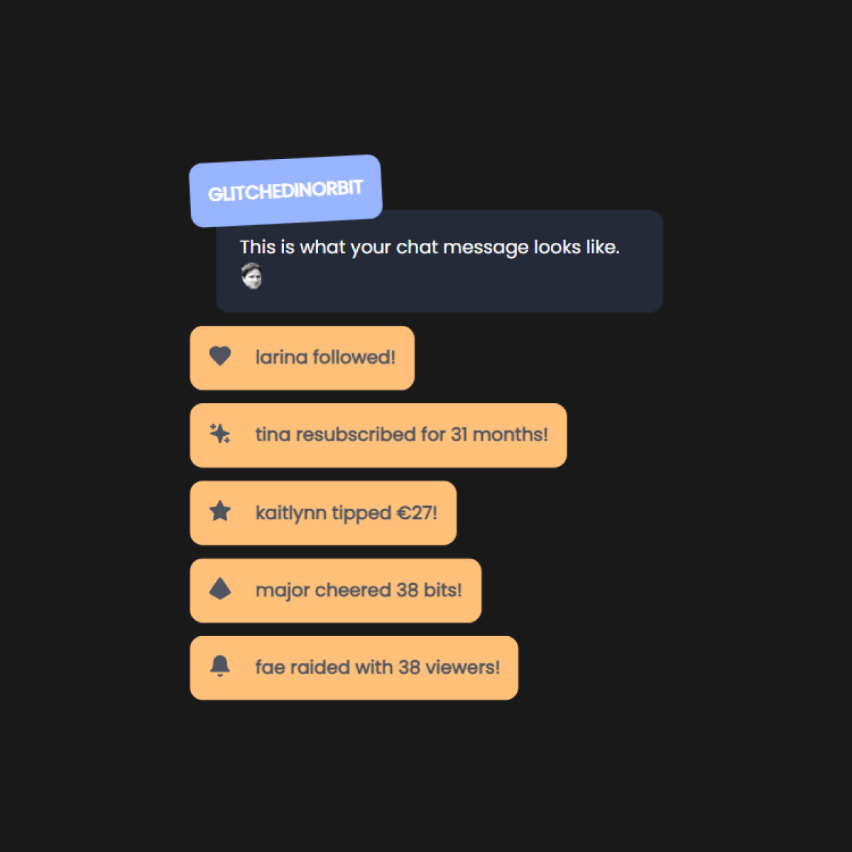
Add the configuration to control events, font, animations, colors, and limits:
{
  "eventsLimit": 7,
  "includeFollowers": "yes",
  "includeRedemptions": "yes",
  "includeHosts": "yes",
  "minHost": 1,
  "includeRaids": "yes",
  "minRaid": 1,
  "includeSubs": "yes",
  "includeTips": "yes",
  "minTip": 1,
  "includeCheers": "yes",
  "minCheer": 1,
  "direction": "top",
  "textOrder": "nameFirst",
  "fadeoutTime": 999,
  "fontColor": "#ffffff",
  "theme": "texture",
  "backgroundOpacity": 50,
  "backgroundColor": "#a3aaa9",
  "iconColor": "rgb(255, 255, 255, 255)",
  "locale": "en-US",
  "testMessage": "Test message",
  "fontName": "Poppins",
  "fontSize": 14,
  "fontWeight": "500",
  "textShadow": "",
  "emoteSize": 20,
  "alignMessages": "flex",
  "nickColor": "messagecolor",
  "customNickColor": "#feffff",
  "displayBadges": "none",
  "messagesLimit": 12,
  "hideAfter": 999,
  "hideCommands": "yes",
  "ignoredUsers": "StreamElements,OtherBot",
  "animationIn": "fadeInLeftBig",
  "animationOut": "none",
  "widgetName": "Custom Chat",
  "widgetAuthor": "glitchedinorbit",
  "widgetVersion": "1.0",
  "widgetUpdateUrl": "https://github.com/{your-github-repository}",
  "userbackgroundColor": "#99b5ff",
  "messagebackgroundColor": "#242a38",
  "sliderNickname": 0,
  "sliderMessage": 10
}
Customize the settings directly in the StreamElements editor for live updates.
Backing Up Your Widget
In order to really make sure we can mess with the code in StreamElements without losing our working widget prototype, let’s make a backup of our code.
Organize locally
-
Create a new folder:
CustomChatWidget. -
Create and save files with the code:
widget.html,widget.css,widget.js, andwidget.json.
Upload to GitHub
-
Create a repository on GitHub.*
-
Commit your
widget.html,widget.css,widget.js, andwidget.jsonfiles. -
Paste the GitHub repository link into your StreamElements Widget Update URL.
  "widgetUpdateUrl": {
    "type": "hidden",
    "value": "https://github.com/{your-github-repository}"
  }
*You can always make your repository public in case you wish to share your code.
Sharing and Selling Your Widget
Currently, sharing StreamElements widgets is not fully streamlined, but you can:
-
Share code as text files: create .txt files for HTML, CSS, JS, Fields, and Data, then zip and share.
-
Share on the StreamElements Discord: follow the guidelines in #widget-share.**
-
Apply for StreamElements’ Overlay Sharing: for eligible users, apply via their form.***
**According to one of the Discord members, there’s a backlog of applications that hasn’t been approved yet. So it’s uncertain how long approval will take and if this method even works.
***This application only applies to businesses and eligible participants of exclusive SE Community programs.
Conclusion
You’ve built your custom Twitch chat widget! 🎉
From here, you can continue tweaking CSS, animations, and field settings to make it truly yours.
Happy streaming!
Sources
C4ldas [@c4ldas]. (2023, October 31). I don’t want to disappoint anyone, but I should say that to avoid frustrations… I’m not sure when submitted widgets are going to be released again, it seems they are not working on that anymore. [Reply] StreamElements Discord.
C4ldas [@c4ldas]. (2023, October 31). Sharing link is for companies who sell widgets, SE partners or people who shared widgets with the community. [Reply] StreamElements Discord.
StreamElements. (n.d.). Custom Widgets. StreamElements Developer Portal. https://dev.streamelements.com/docs/api-docs/775038fd4f4a9-stream-elements-custom-widgets
Digital Products
Cutify your stream with my Comfy Chat Widget
Streamline your content creation workflow with my Minimal Stream Deck Icons
Affiliate Links
• Get YouTube growth tools on vidIQ
I receive a small commission if you purchase via these links.
Recommended Posts

Use The PayPal Buffer System To Protect Your Creator Income
A neurodivergent-friendly guide to keeping your creator and streaming income safe and stress-free.
Continue Reading
Financial Sustainability Tips For Neurodivergent Streamers (Without Burnout)
Content pacing, energy-based planning, and income strategies for disabled and neurodivergent streamers.
Continue Reading
Protecting Your Privacy As A Streamer
A guide to help streamers protect their privacy online and in-person, including tips for safeguarding finances, address, accounts, and physical...
Continue ReadingRecommended Items